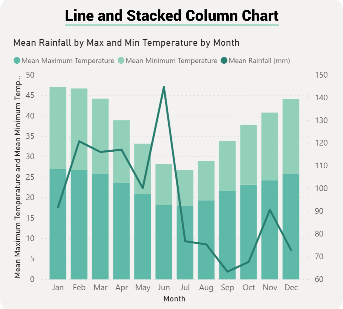
Power BI Line and Stacked Column Chart
The Line and Stacked Column Chart is a combo charts that combines the Line chart and Column chart together in one visual. By combining these two visuals together, you can make a very quick comparison between two sets of measures.
The main benefit of this type of chart is that you can have one or two Y axes. What this means is that you can either display two measures that would have the same Y axis, something like Total Sales and Profit. Or, we could show two measures that are based on completely different values such as Order Quantity and Profit.