Power BI Stacked Column Chart
A stacked column chart displays values where the height of each column segment is proportional to the data. It combines the clarity of column charts (vertical orientation) with the ability to show how different categories or segments contribute to a total. Column charts display a measure against a single dimension, with an optional second dimension to break down and compare contributions.
Key difference from bar charts: Orientation only. Functionally identical to stacked bar charts—same strengths, same limitations, same use cases. The vertical orientation makes column charts particularly effective for time-series data and trends.
Overview
Stacked column charts are ideal for visualizing performance over time, composition across periods, and trend analysis with segment breakdown. Use this visual when you need to:
Show how totals change across time periods while revealing the composition of each total
Compare how different segments contribute to overall performance across months, quarters, or years
Track trends over time while maintaining visibility of individual segment performance
Identify seasonal patterns or growth trends by segment
Common Business Scenarios
Revenue Trends: Monthly or quarterly revenue by product line or region, showing growth trends
Sales Performance: Weekly/monthly sales by sales channel (retail, wholesale, online)
Website Analytics: Monthly page views or sessions broken down by traffic source (organic, paid, referral)
Production Output: Monthly units produced by production facility or product line
Customer Acquisition: Monthly new customers by acquisition channel
Budget Allocation: Monthly budget spend by department or cost center
Inventory Levels: Monthly inventory value by warehouse or product category
Why Use a Stacked Column Chart?
The stacked column chart is superior to alternatives in scenarios where you need to emphasize:
Trend visibility – Vertical columns make growth/decline immediately obvious
Temporal progression – Horizontal flow naturally represents time passing
Segment contribution – Color-coded segments show what drove the trend
Period-to-period comparison – Easy to compare "this month vs. last month" visually
When to Use a Stacked Column Chart
A stacked column chart is your ideal visual choice when you need to satisfy three conditions simultaneously:
You want to show trends over time – How values change across periods (months, quarters, years)
You want to show composition – How different segments contribute to each period's total
You have 3–5 segments to compare – Enough data to be interesting, but not so much that the chart becomes cluttered
Choose a stacked column chart if you're asking questions like:
"How has our monthly revenue grown this year, and which product lines are driving that growth?"
"What are our website traffic trends by source? Which channels are growing fastest?"
"How is our sales team's productivity trending month-to-month, broken down by sales representative?"
"How has our manufacturing output evolved, and which products are we producing more of?"
If you only care about composition (ignoring trends), consider a pie chart. If you only care about comparing values across time (ignoring composition), use a line chart. If you need side-by-side comparison without stacking, use a clustered column chart. The stacked column chart uniquely excels when you need all three: trends + composition + comparison.
How to Use a Stacked Column Chart
The stacked column chart is versatile, suitable for everything from simple dashboards to complex multi-dimensional analysis. We'll explore three progressive examples below, from simple visualization to more complex scenarios.
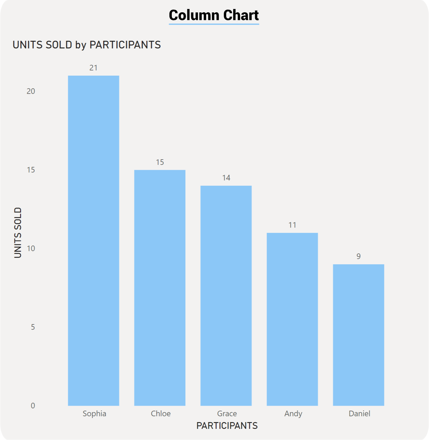
Example 1: Simple Stacked Column Chart – Monthly Revenue Trend
Scenario: An e-commerce business wants to track monthly revenue over a quarter to visualize growth trends.
What You'll See: Four columns arranged horizontally in ascending height, clearly showing revenue growth across the quarter. The vertical orientation makes the upward trend immediately obvious.
Why This Works: A column chart at its simplest is a trend leaderboard. Reading trends left-to-right (horizontal time flow) is natural and intuitive. A reader can answer "What's our revenue growth?" in one second by looking at the increasing column heights.
Comparison to Bar Chart: The same data in a bar chart would show horizontal bars of increasing length. While readable, the columns' vertical arrangement more naturally communicates "growth over time."
Key Insight: Revenue shows consistent 10–14% month-to-month growth, indicating healthy business momentum.
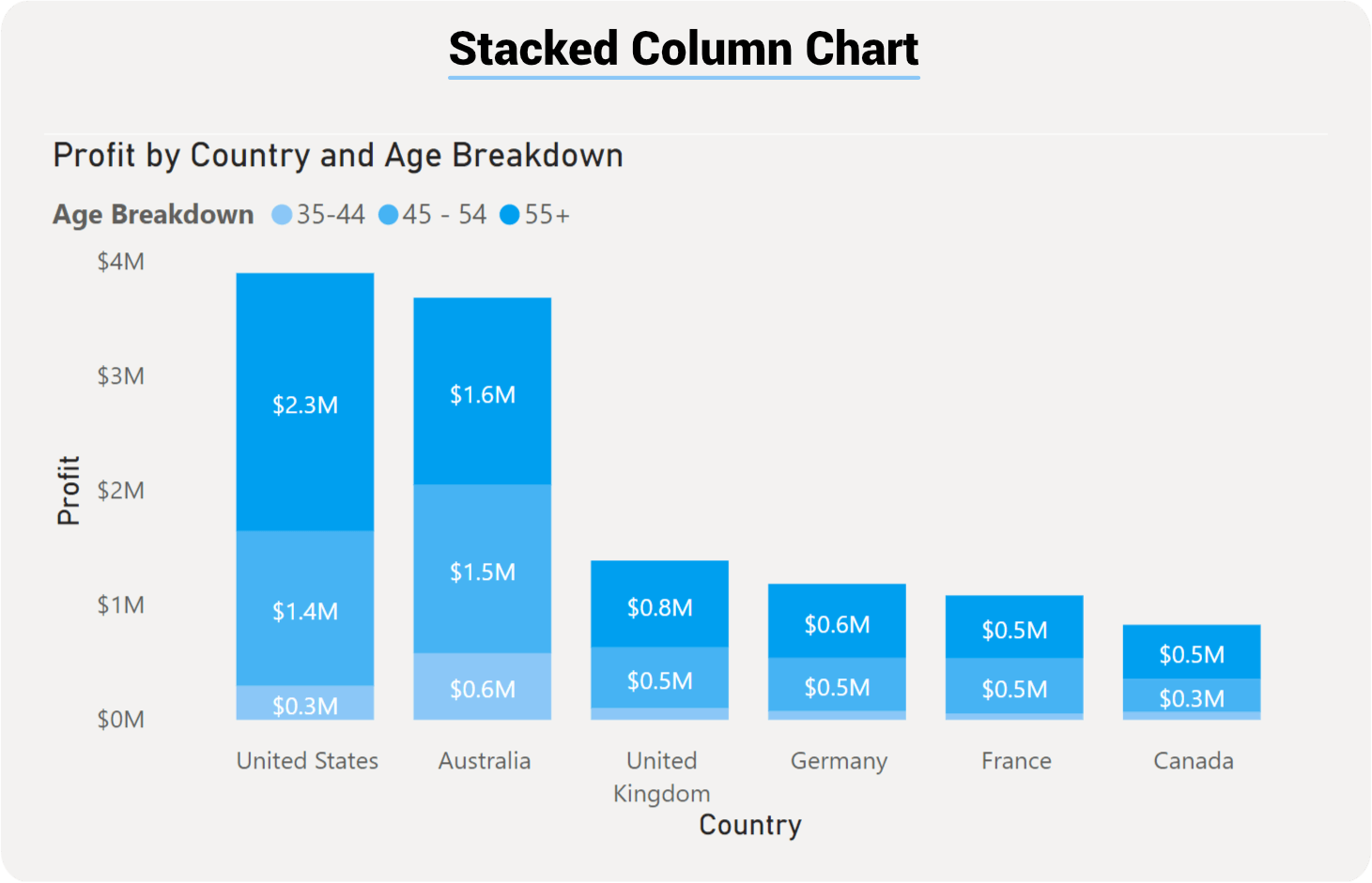
Example 2: Stacked Column Chart with Legend Breakdown – Monthly Revenue by Channel
Scenario: The same e-commerce business now wants to see how revenue is composed of different sales channels (Direct, Marketplace, Wholesale) across the same four months.
What You'll See: Four stacked columns, each divided into three colored segments representing sales channels. The total column height shows overall revenue, while segment size reveals channel contribution in that month.
Insights You'll Gain:
Total growth is consistent – All columns increase in height (positive trend)
Direct channel dominates – Bottom segment (Direct) is largest across all months (~50% of revenue)
Marketplace is growing – Segment grows from $48K (38%) to $68K (40%), showing increased market share
Wholesale plateaus – Top segment stays flat at ~$15–17K, suggesting market saturation or focus shift
Why Columns Work Better Here: Comparing month-to-month trends while seeing segment contribution is more intuitive with vertical columns. The bottom segment (Direct) is easy to track as it grows. The horizontal arrangement naturally guides the eye through the time progression.
Example 3: ADVANCED – SMALL MULTIPLES WITH QUARTERLY PERFORMANCE BY REGION
Scenario: A B2B software company wants to analyze quarterly sales performance across three regions (North America, Europe, Asia Pacific), broken down by product type (Software, Services, Support). They use small multiples to compare regional patterns.
Data Summary (showing North America in detail; Europe and APAC abbreviated):
What You'll See: Twelve columns arranged in three sections (one per region), with each section showing four quarters. Each column is stacked by product type (colored segments). This allows pattern comparison across regions.
Insights You'll Gain:
Consistent regional rankings: Asia Pacific leads in Q1–Q4 revenue (right section shows tallest columns)
North America shows strongest growth: Quarters increase in height most dramatically (left section)
Software dominates all regions: Bottom segment (Software) is largest across all quarters and regions
Services steady but slower growth: Middle segment grows modestly compared to Software
Support is stable: Top segment shows minimal change, suggesting mature support revenue
Europe lags in growth: Middle section shows less vertical progression than other regions
Q4 strongest: All regions peak in Q4 (rightmost columns tallest)
Why Small Multiples Work Here: Three dimensions of data (Region, Quarter, Product Type) would be cluttered in a single chart. Small multiples keep each region's comparison clear while allowing readers to spot patterns (e.g., "North America growth rate vs. Europe growth rate").