Power BI Stacked Bar Chart
A stacked bar chart is a type of bar chart that shows the contribution of each category to a total. The bars are stacked on top of each other, with each category represented by a different color or pattern. This makes it easy to see how the categories compare to each other and how they contribute to the total.
Overview
Stacked bar charts are a versatile tool that can be used to visualize a variety of data. They can be used to compare multiple categories, show changes over time, or track trends. For example, you could use a stacked bar chart to compare the sales of different products in a store, to show how the number of students in a school has changed over the years, or to track the number of website visitors over time.
Power BI Stacked Bar charts display values (i.e. measures) where the length of the bar is proportional to the data. Bar charts are means to display a measure against a single dimension. A second dimension can break the primary dimension further more. But it always breaks the measures down into the primary dimension, which is the main x-axis.
When to Use a Stacked Bar Chart
A stacked bar chart is your ideal visual choice when you need to satisfy three conditions simultaneously:
You want to show composition – How different segments contribute to a total value
You want to compare totals – See which categories have the highest overall performance
You have 3–5 categories to compare – Enough data to be interesting, but not so much that the chart becomes cluttered
Choose a stacked bar chart if you're asking questions like:
"Which country generated the most profit, and what age groups drove that profit?"
"How much did each vendor contribute to our PC parts revenue by segment and location?"
"Who sold the most tickets, and what was the source of those sales?"
If you only care about composition (ignoring totals), consider a pie chart. If you only care about comparing values (ignoring composition), use a clustered bar chart. The stacked bar chart uniquely excels when you need both simultaneously.
How to Use a Stacked Bar Chart
The Stacked Bar Chart is a very versatile visual. It can be used for simple leaderboard and single dim comparison, into a full fledged comparison between categories and sub-categories. We’ll explore 3 examples below of how to use a Stacked Bar Chart from simple visualization into a more complex one.
1- A Simple Stacked Bar Chart:
Let us look at a simple example of a Stacked Bar Chart. The following table shows a participants in a charity and the number of tickets sold by each participant. In its simplest form, we can use a Stacked Bar Chart is a leaderboard visual to rank participants with the number of tickets sold.
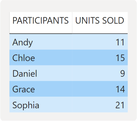
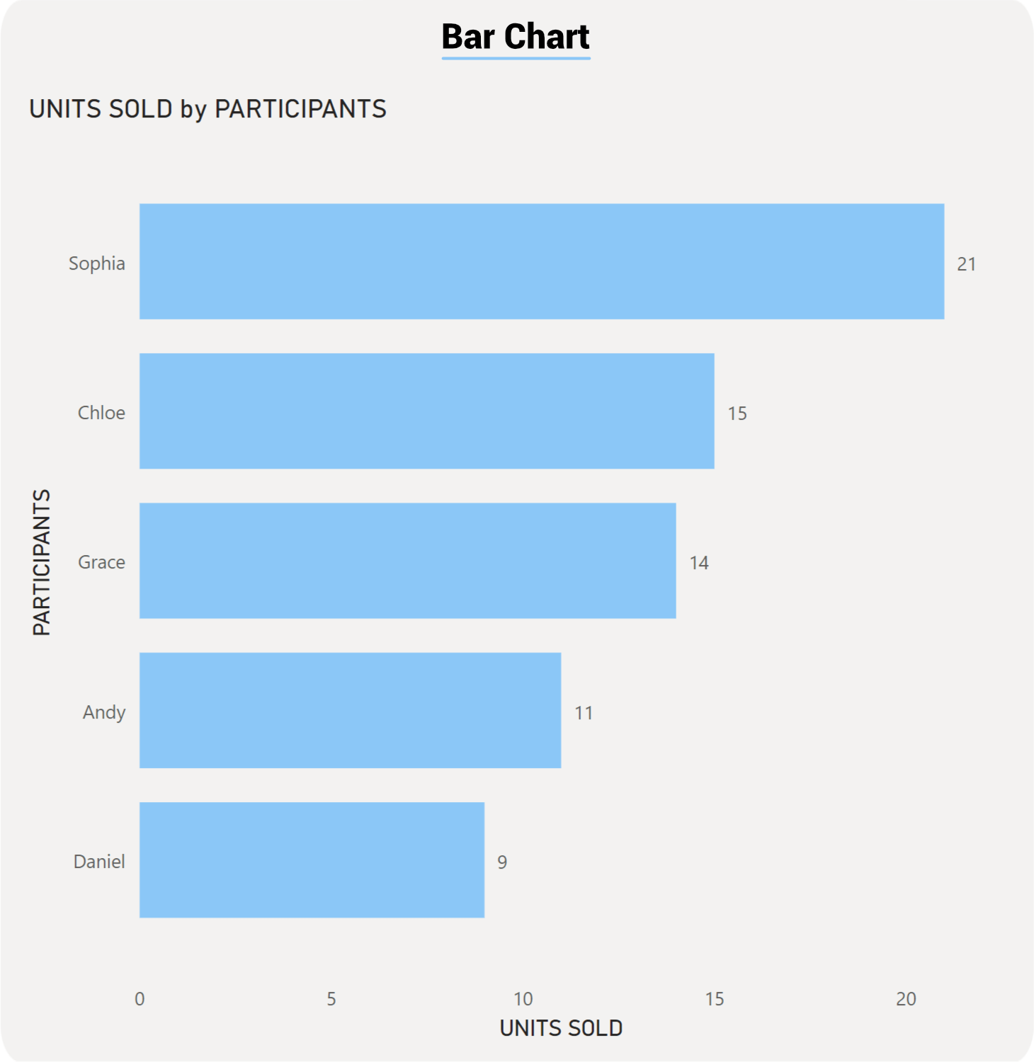
The name of the participants are our main category on the Y-Axis and the units/tickets sold are on the X-Axis.
2- A Stacked Bar Chart with a Legend breakdown:
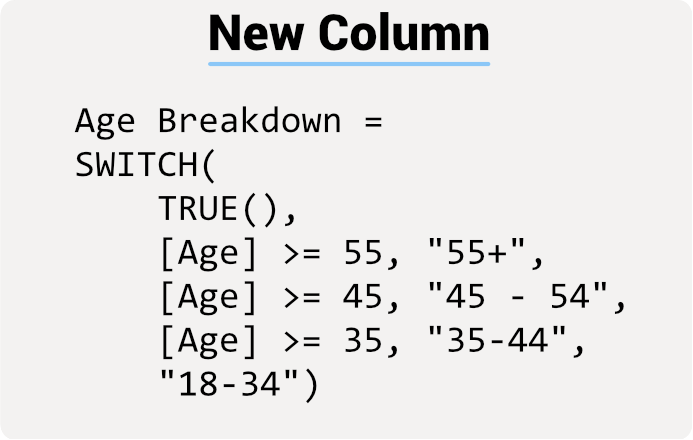
Now let us look at a slightly more complex example of a Stacked Bar Chart. Our data shows the sales across different countries. We want to further breakdown our sales the by age brackets in each country. So we create a new column that group age ranges into a new “Age Breakdown”. We also want to measure the profit instead of the sales and as such create a new measure for Profit.
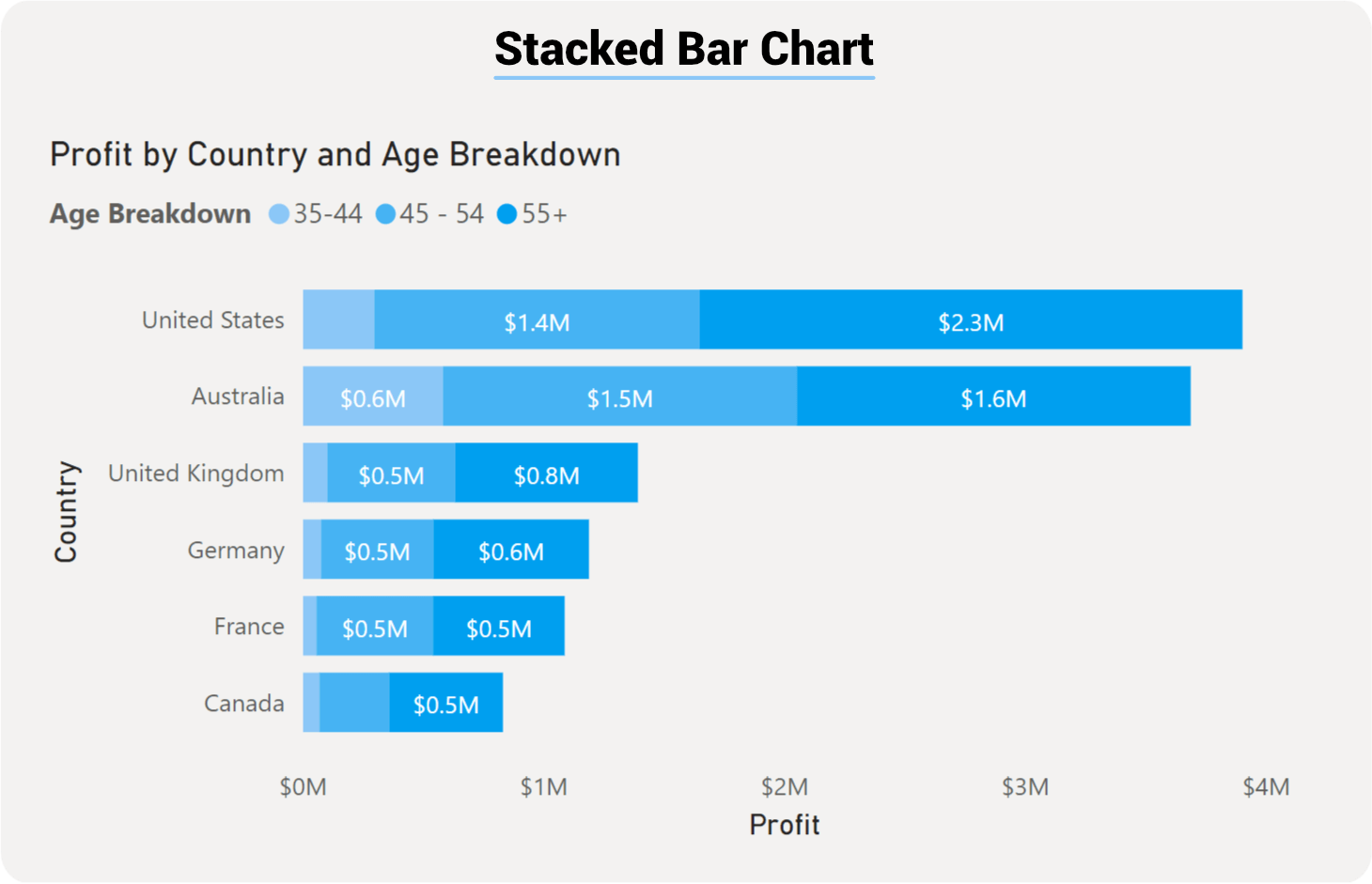
The stacked bar chart can also show a breakdown of the values and show contribution to the whole. Here is an example of a stacked bar chart that shows the profit by country broken down by age:
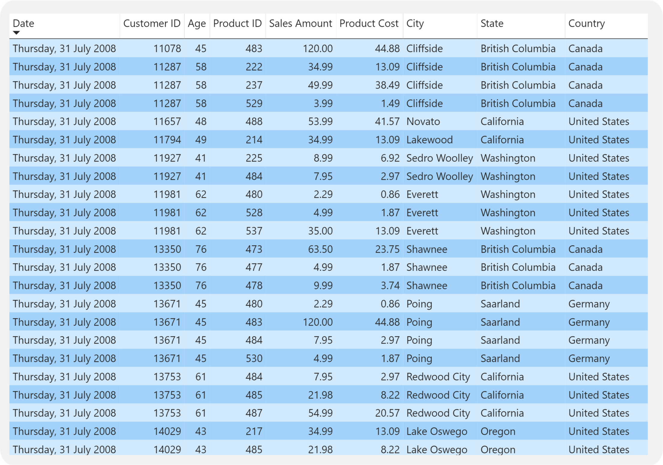

With our new dim (i.e. Age Breakdown) and new Profit measure we can rank profit in each country that is broken down by age group.
3- A Stacked Bar Chart broken down with Small Multiples
The following simulated transactions are for a PC parts vendor. Each record is for a single item type and a number of units sold of that item, in which city it was sold and which segment of market was it sold to. There are cost of each item, net profit calculations and gross profit calculations. What we want to is display all sales broken down by city and by segment.
We are able to generate the following visual using a single Stacked Bar Chart.
Best Practices for Stacked Bar Charts
Apply these best practices to maximize the effectiveness and readability of your stacked bar charts:
1. Limit Your Legend to 3–5 Segments Maximum
Each additional color segment makes the chart harder to interpret. If you have more than 5 categories to display, consider:
Aggregating smaller categories into an "Other" group
Splitting the data across multiple visuals using small multiples (as shown in Example 3)
Using filters to show only the most relevant segments
Why it matters: The human eye struggles to distinguish subtle color differences when many segments exist. Each additional segment reduces the effectiveness of all previous segments.
2. Sort by Total Value for Immediate Impact
Always sort your bars by total length (largest to smallest) unless you have a specific reason not to (e.g., chronological order, alphabetical order per business requirements).
Example: In Example 1, we ranked participants by total tickets sold. This immediately shows the top performers without requiring the reader to mentally add up segment lengths.
Impact: Readers can answer "Who performed best?" in one second instead of scanning the entire chart.
3. Use Color Strategically and Consistently
Assign intuitive colors where possible (profit = green, loss = red, or use your brand color palette)
Keep the same color assignment across all your articles and dashboards
Use a colorblind-friendly palette to ensure accessibility
Avoid using more than 5–7 distinct colors (reinforces the segment limit)
Example: In our examples, "Electronics" is always the same color across all charts, making it instantly recognizable to users who work with the data regularly.
4. Keep the First (Bottom) Segment Visually Prominent
The bottom segment shares a baseline with all other bars, making it the easiest to compare across the chart. Place your most important metric or largest category at the bottom to leverage this advantage.
Tip: If you're tracking profit by segment, place your highest-margin product at the bottom to make performance comparison effortless.
5. Label Axes Clearly with Units
Always include units on your axes:
Use "$" for currency values
Use "Units Sold" or "Quantity" for counts
Use "%" for percentages
Include the time period or date range if relevant
Vague axis labels force readers to guess what they're looking at. Clear labels eliminate ambiguity in seconds.
6. Avoid Overloading with Too Many Categories
If you have more than 15–20 bars to display, your chart becomes a cluttered, unreadable mess. Instead:
Filter to show only the top 10 performers
Group data by quarters instead of months
Use small multiples to break the data into digestible sections (as in Example 3)
Link to a detailed table for the complete dataset
Readability matters more than completeness.
7. Test with Real Data
Before publishing, test your chart with real data to ensure:
Legend colors are clearly distinguishable
Bar labels don't overlap or become unreadable
Very small segments are still visible (consider a minimum threshold)
The chart tells a coherent story without additional explanation
8. Use Consistent Color Coding Across Your Dashboard
If "Electronics" is blue in one chart, it should be blue in every chart on your dashboard. This creates a mental shortcut for users and reduces cognitive load.
Related Visuals & When to Use Alternatives
The stacked bar chart is powerful, but it's not always the best choice. Here's how to decide when to use alternatives:
| Visual Type | Best When | Example Use Case | Key Difference |
|---|---|---|---|
| Stacked Bar Chart | You need to show composition AND compare totals across many categories | Revenue by country broken down by age group | Bottom segment shares a baseline; easiest for comparisons |
| Clustered Bar Chart | Side-by-side comparison matters more than showing composition | Comparing product performance across quarters without breakdown | No stacking; each segment appears separately |
| 100% Stacked Bar Chart | Relative composition (percentages) matters more than absolute values | Market share by vendor—seeing proportion is key, not absolute revenue | All bars are the same height; normalized to 100% |
| Pie Chart | You're showing composition of a SINGLE total only | Market share breakdown (one company, one time period) | Shows only one data point; limited to one category |
| Line Chart | Trends over time are more important than composition | Website traffic over 12 months (with or without source breakdown) | Emphasizes progression and change; not composition |
| Small Multiples (Separate Charts) | You want to compare patterns across a third dimension | Profit by product, broken by segment, shown separately for each city | Creates separate mini-charts rather than one complex chart |
| Table or Matrix | Precise values matter more than visual patterns | Detailed profit data with exact dollar amounts (not a chart at all) | Prioritizes accuracy over visual scanning |
Decision Framework:
Need to compare values AND show composition? → Stacked Bar
Need to compare side-by-side without composition? → Clustered Bar
Need to show percentages/proportions? → 100% Stacked Bar
Showing only ONE total's breakdown? → Pie Chart
Emphasizing change over time? → Line Chart
Comparing across 3+ dimensions? → Small Multiples
Readers need exact numbers? → Table
Limitations & Considerations
While stacked bar charts are versatile, they have important limitations you should understand:
1. Difficult to Compare Middle or Top Segments
Only the bottom segment shares a common baseline with all other bars. Middle and top segments "float" at different starting points, making them difficult to compare accurately.
Example: In Example 2 (Country comparison), it's easy to compare the "Under 18" segment (bottom) across countries, but comparing the "31-45" segment requires mental math. This is why we place the most important or largest segment at the bottom.
Workaround: If comparing a middle segment is critical, consider using clustered bars or small multiples instead.
2. Performance Degrades with Large Datasets
Each bar requires rendering multiple colored segments. If you're plotting:
100+ categories (bars) with 5 segments each = 500 visual elements
This can slow Power BI rendering and make the chart difficult to scan
Workaround: Filter to show only the top 10–20 performers, or aggregate data by quarter instead of month.
3. Color Blind Users May Struggle
If you rely solely on color to distinguish segments, users with color blindness will struggle. Always:
Use a colorblind-friendly palette (see coolors.co for options)
Include segment labels or a clear legend
Test your colors with a colorblind simulator (online tools available free)
4. Small Segments Become Invisible
If one segment represents less than 2–3% of the total, it may appear as a barely-visible sliver on the bar. Users might assume it doesn't exist.
Workaround: Aggregate very small segments into an "Other" category, or create a secondary chart showing the detail of small segments.
5. Not Ideal for Showing Change Over Time
While you CAN show time periods (e.g., months) on a stacked bar chart, the vertical orientation makes it harder to see trends visually. A line chart with the same data would better emphasize progression.
Example: January $125K → February $143K → March $156K is easier to see as an upward trend in a line chart than as three separate bars of increasing height.
6. Stacking Obscures Proportional Understanding
In a 100% stacked bar chart, all bars are the same height (100%), so you can easily see percentages. In a regular stacked bar chart, segments grow and shrink both because values change AND because the total changes. This can be confusing.
Workaround: If proportions matter more than absolute values, use a 100% stacked bar chart instead.
7. Legend Placement Matters
If your legend is far from the chart (e.g., on the opposite side of the page), readers must constantly refer back and forth to interpret colors. Place the legend:
To the right of the chart (most natural)
Below the chart (if space is limited)
NEVER on the opposite side of the page
8. Mobile Responsiveness
Long category names or too many segments can cause horizontal scrolling on mobile devices, making the chart unusable. Always test on mobile, and consider:
Abbreviating category names
Rotating labels at an angle
Using a mobile-optimized version with fewer categories
Power BI Configuration Tips
Here's how to optimize your stacked bar chart setup in Power BI for best results:
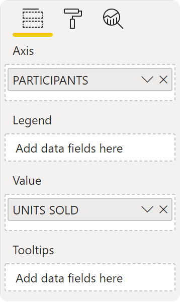
1. Field Setup
Axis: Drag your category dimension (e.g., "Country," "Participant Name," "Product Type")
Value: Drag your measure (e.g., "Total Profit," "Revenue," "Units Sold")
Legend: Drag your secondary dimension (e.g., "Age Bracket," "Market Segment," "Product Category")
Small Multiples: (Optional) Drag a third dimension to repeat the chart across values (e.g., "City")
2. Formatting Best Practices
Data Colors Tab:
Assign intuitive colors to legend items (profit=green, costs=red, etc.)
Use a colorblind-friendly palette
Test all colors for accessibility
X-Axis Tab:
Format numbers with appropriate units ($, %, etc.)
Set a reasonable scale (auto-scale usually works, but verify)
Enable axis labels so values are visible
Y-Axis (Categories) Tab:
Sort by "Value (descending)" to rank bars from longest to shortest
Ensure category labels are fully visible (adjust label font size if needed)
Consider abbreviating long names (e.g., "NSW" instead of "New South Wales")
Legend Tab:
Position to the right or below the chart (not left, not above)
Ensure legend items are clear and match your color assignments
Test that all colors are distinguishable
Data Labels Tab:
Consider displaying the total value at the end of each bar (not segment values—too cluttered)
Use a font size that's readable but not overwhelming (usually 9–11pt)
Format currency labels with $ and no decimal places (e.g., "$145K" not "$145,234.56")
3. Performance Optimization
For Large Datasets:
Filter to show only the top 10–20 performers using a Top N filter
Use slicers to let users focus on specific segments
Aggregate data by quarter or month (not daily) if possible
For Complex Scenarios:
Use small multiples (Example 3) instead of a single massive chart
Split data across multiple pages if needed
Consider using tooltips to show detailed data without cluttering the main visual
4. Sorting and Presentation
Default Sort:
Sort by total value (descending) unless chronological order is required
This puts the highest performers at the top for immediate visibility
Interactive Elements:
Add slicers for Date Range, Region, or other key dimensions
Enable drill-through or cross-filtering to other report pages
Use tooltips to show additional context (e.g., profit margin %, growth %, etc.)
5. Testing Checklist
Before publishing your chart:
All colors are colorblind-friendly
Legend items are clear and match the colors used
Axis labels include units (currency, quantity, etc.)
Category names are fully visible and don't overlap
The chart tells a clear story without additional explanation
Small segments (less than 3% of total) are grouped into "Other"
Mobile responsiveness is acceptable (test on a phone or tablet)
Performance is acceptable with your actual data volume
Stacked bar charts are a powerful tool that can be used to visualize a variety of data. They are easy to create and use, and they can be customized to meet your specific needs.
Note: Both the Bar and Column charts are very similar in setup and how they visualise data. The only difference here will be the orientation: the Bar chart uses rectangular bars, while the Column chart displays the bars vertically.