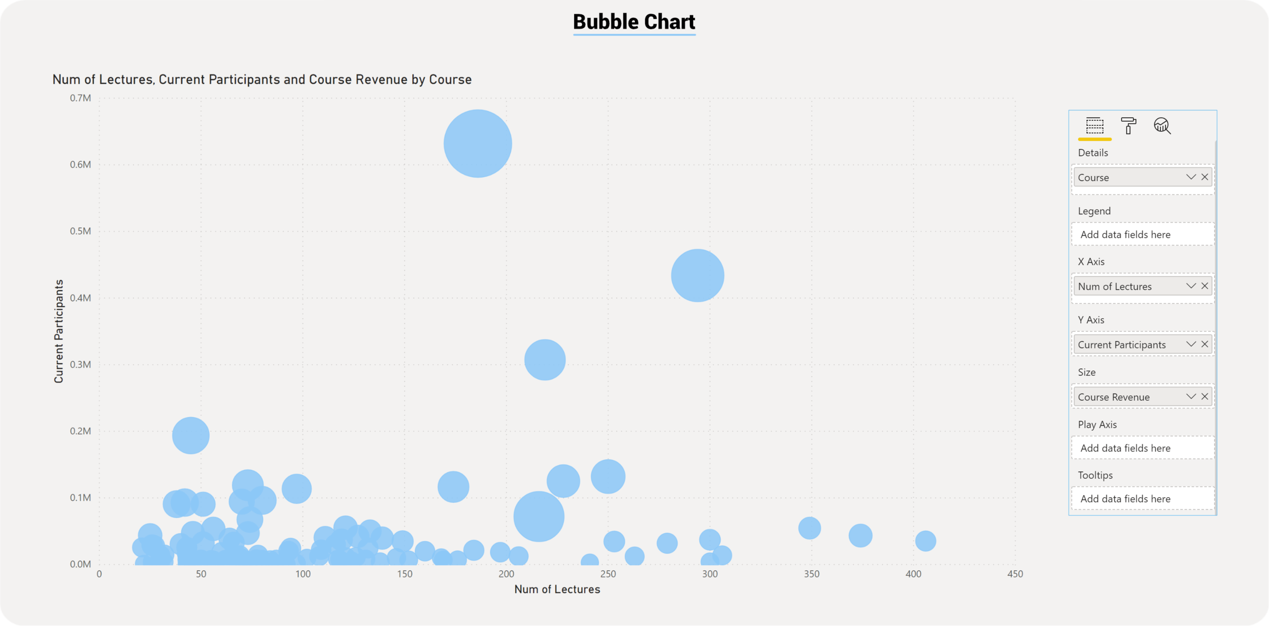
Power BI Scatter and Bubble Charts
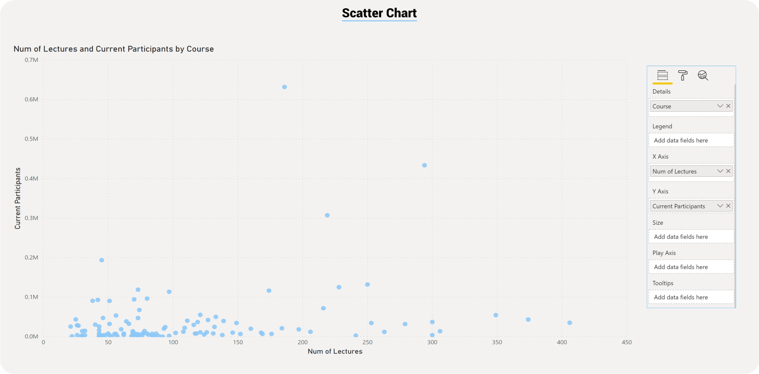
Scatter charts, also known as Bubble chart, show correlations between two or three points of data. Using two points of data we consider the chart a scatter chart, when adding a third point of data then the chart will become a bubble chart. We usually use the third point for sizing, which turns the points into a circle with varying sizes based on the data in the size field.

Scatter Chart
Bubble Chart
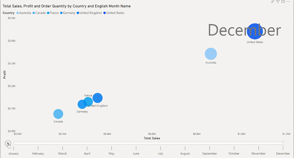
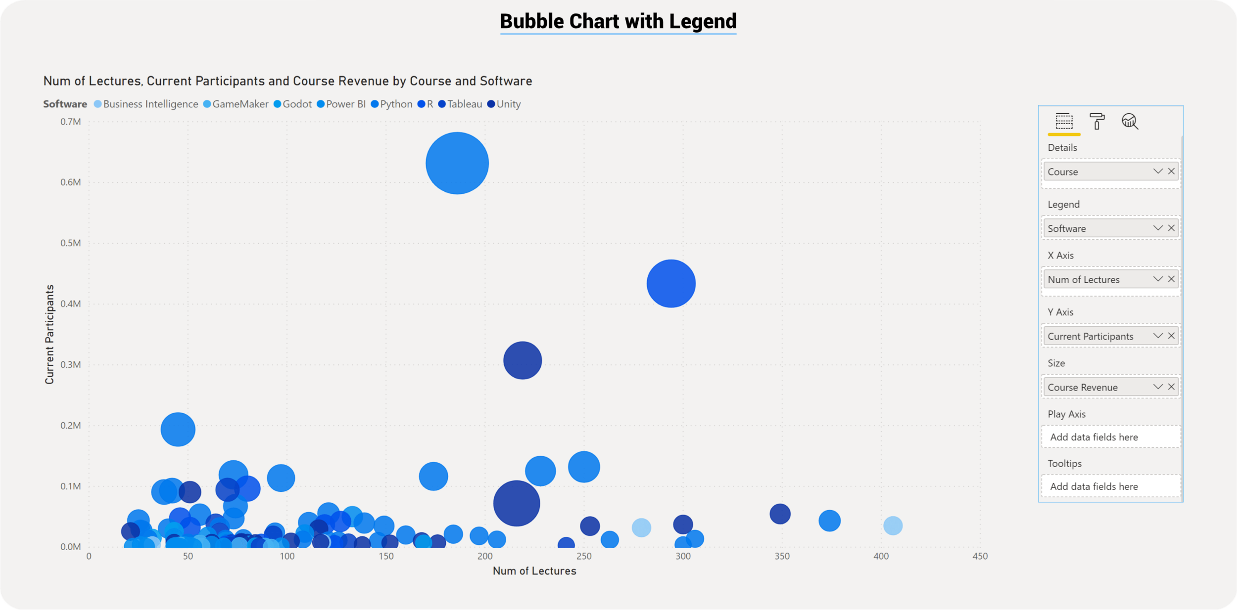
Adding Legends to a Bubble Chart
Scatter chart provides a unique option to bring data to life within the Format Area, called the Play Axis. Activating the Play Axis will allow the chart to animate showcasing how the data progresses through time. A manual manipulation of the animation is also possible.