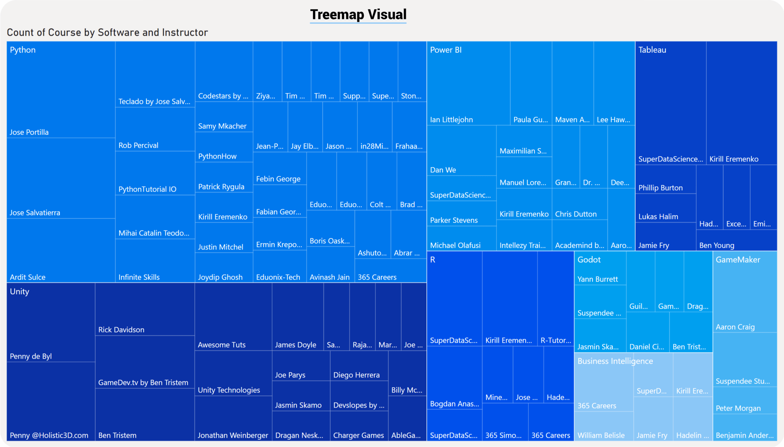
Power BI Treemap

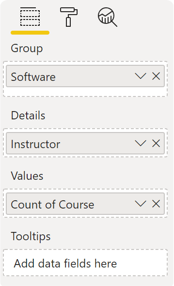
Treemap is a great visual for displaying hierarchies. It accomplishes this by nesting the data in rectangles, represented by colour, commonly known as a “branch“. If you add a category into the Details section of the visual, it will segment the branch into smaller “leaves“, hence the name Treemap.
Power BI bases the size of the space inside each rectangle on the measured value. The visual arranges the rectangles in size from top left (largest) to bottom right (smallest).