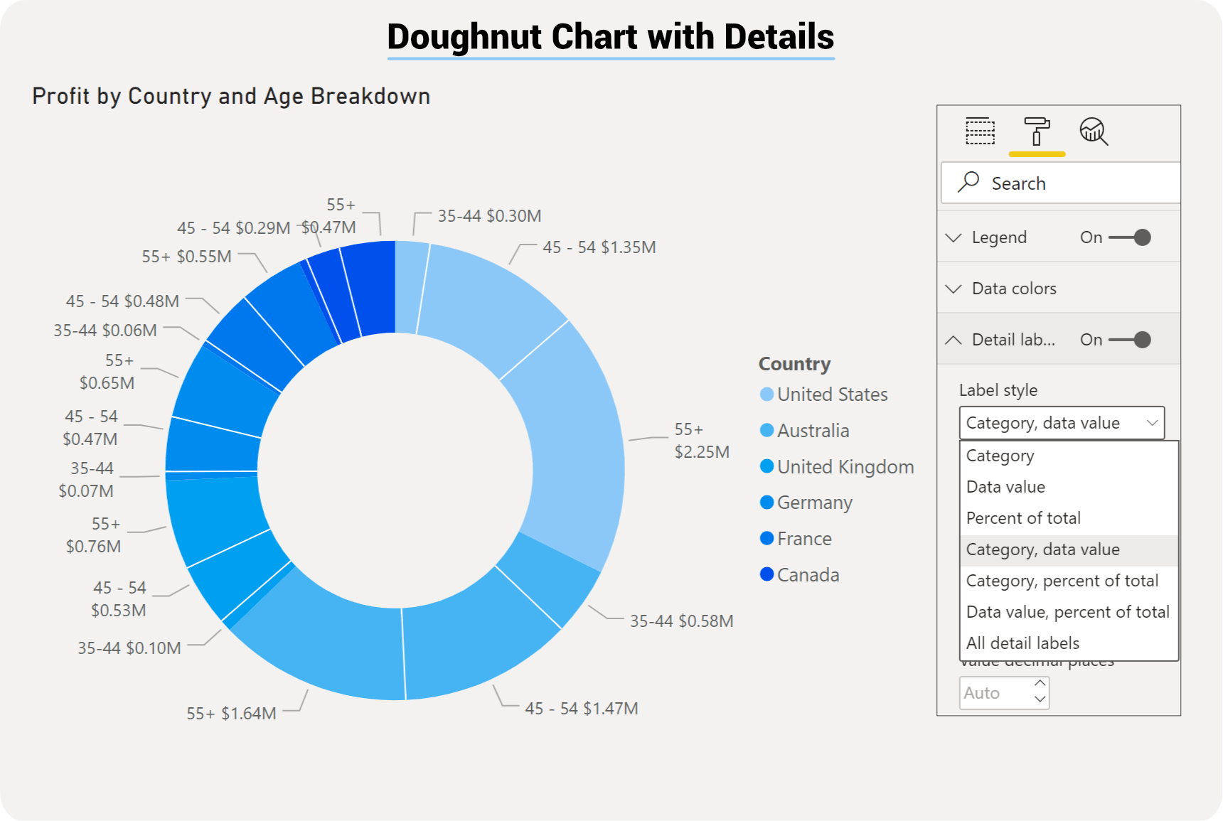
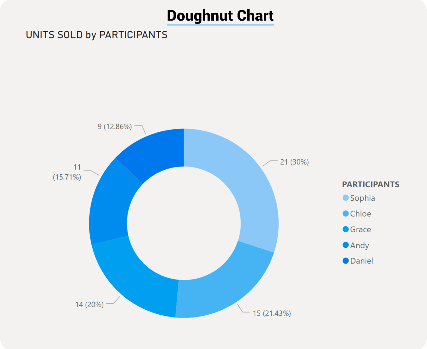
Power BI Doughnut Chart
Doughnut charts compare values from a single dimension. The charts are used to visualise a particular section to the whole, rather than comparing individual values to each other. For example, you can compare the number of products sold by each salesperson. It shows values as a percentage of the whole.
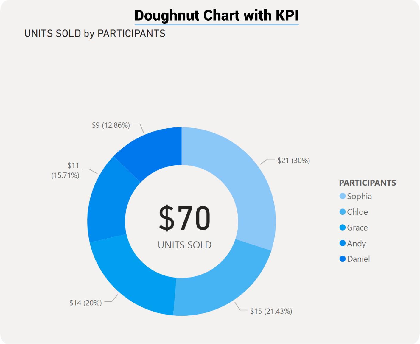
The difference between a pie and a doughnut chart is the doughnut chart has a hole in the middle, which you can layer on top of a label or KPI visual.
Doughnut chart can be very effective in allowing interactive filtering, but if there are too many categories it can become difficult to read and interpret.