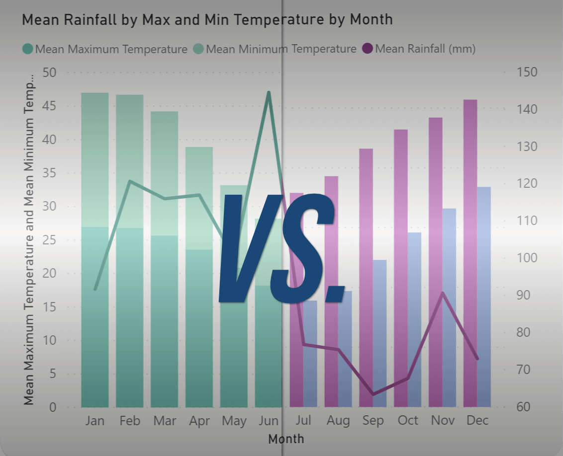
Line and Clustered Column Chart vs. Line and Stacked Column Chart
Both the Line and Clustered Column Chart and the Line and Stacked Column Chart are popular visualization tools in Power BI, and while they share similarities, they have distinct applications. Let's delve into their practical differences and the case studies best suited for each.
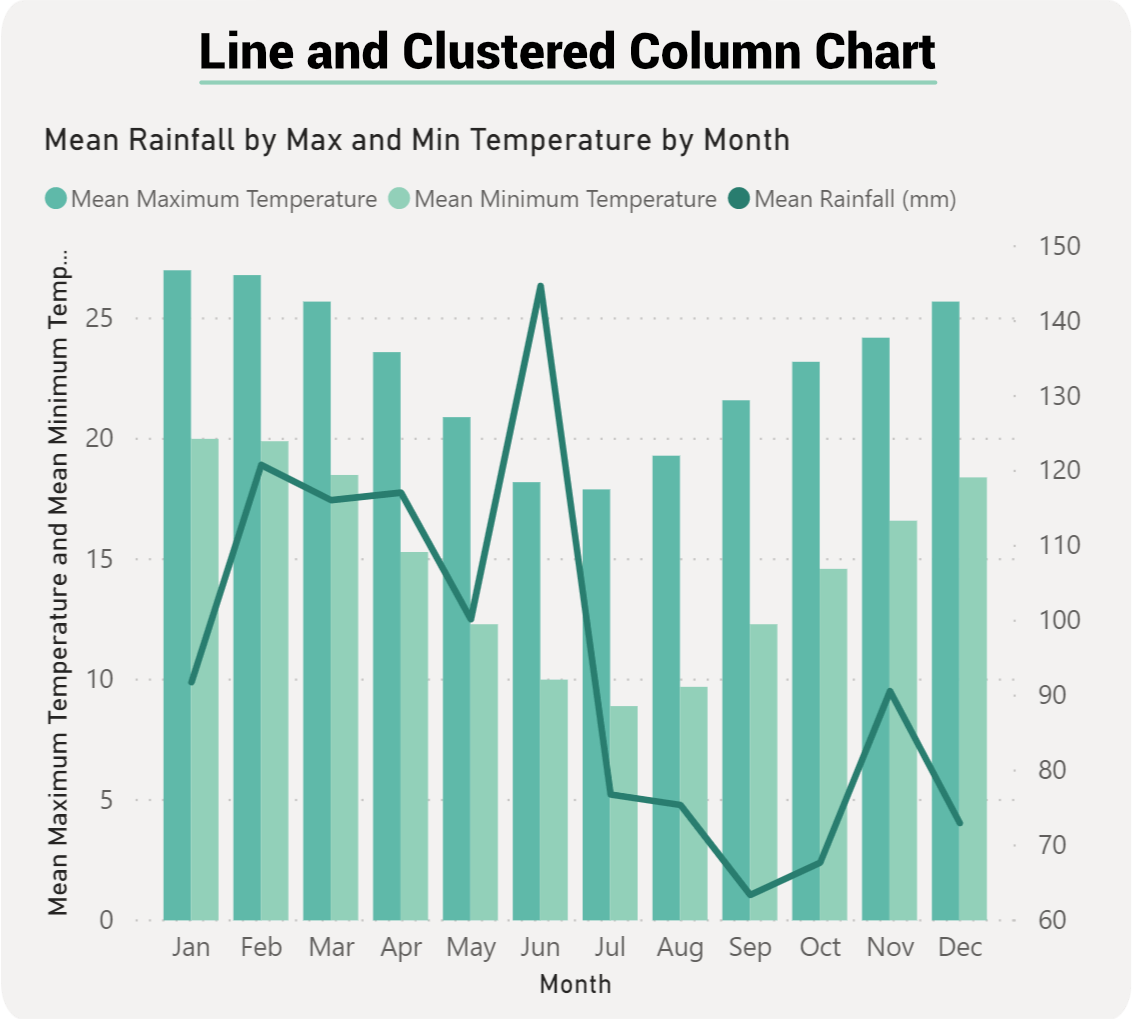
Line and Clustered Column Chart:
Description:
This chart type combines a line chart and a clustered column chart. The columns are grouped side-by-side based on categories, allowing for a direct comparison between individual categories.
Practical Differences:
Distinct Comparisons: It emphasizes individual category values and is ideal for comparing the absolute values of each category.
Dual Axis: Typically used when the line and column values have different scales.
Clarity in Individual Data Points: Since the columns are clustered, it's easier to compare individual data points within a category.
Line and Column Column Chart is Most Suitable for:
Sales Analysis Across Multiple Products: Imagine a company that sells multiple products. Using this chart, they can showcase monthly sales of each product (clustered columns) against the overall monthly growth rate (line). It allows stakeholders to see how each product is performing in terms of sales, and how this contributes to the overall growth rate.
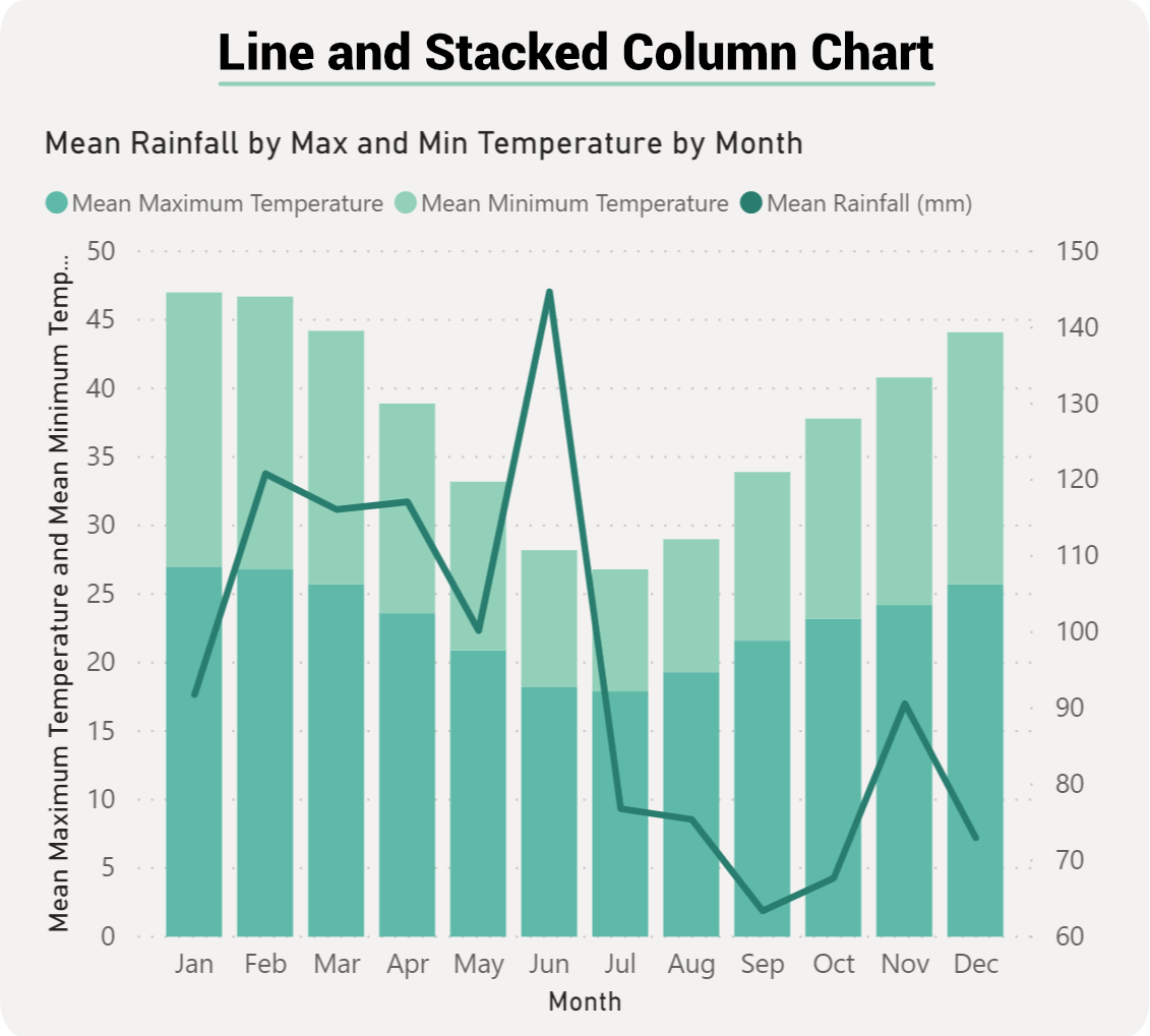
Line and Stacked Column Chart:
Description:
This chart type integrates a line chart with a stacked column chart. The columns are stacked on top of one another, representing the cumulative total of the categories.
Practical Differences:
Cumulative Comparisons: It emphasizes the total value of all categories combined, while still breaking down the contribution of each category.
Portion Analysis: Allows for the analysis of individual category's portion or share of the total.
Dual Axis: Like the clustered variant, it's commonly used when the line and column values have different scales.
Line and Stacked Column Chart is Most Suitable for:
Website Traffic Analysis: Consider a website that gets traffic from various sources like direct visits, social media, search engines, and referrals. Using the Line and Stacked Column Combo Chart, the company can display the monthly total traffic (stacked columns with each source's contribution) against the website's monthly bounce rate (line). This visualization provides insights into the traffic contribution from each source and how it correlates with the bounce rate.

Pros and Cons of a Line and Clustered Column Chart:
The Line and Clustered Column Chart is a versatile visualization tool, but like any chart type, it comes with its own set of advantages and disadvantages. Let's explore the pros and cons:
Pros:
Dual Visualization: It combines two types of charts, allowing for a richer representation of data. This is particularly useful when trying to convey two distinct data points or metrics simultaneously.
Dual Axis: The ability to have two Y-axes can be very beneficial when the data points have different scales. For example, you can showcase sales figures (in thousands or millions) alongside growth rate percentages.
Clear Comparisons: The clustered columns make it easy to compare values across categories. For instance, if you're comparing sales of different products month by month, the clustered columns provide a clear side-by-side comparison.
Flexibility: It can be used in various scenarios, from financial analyses to operational metrics, making it a versatile tool in your data visualization toolkit.
Reduces Need for Multiple Charts: Instead of having separate line and column charts, you can combine the data into one chart, reducing clutter in your reports.
Cons:
Potential for Overwhelming Information: Combining two charts means you're presenting double the information, which can be overwhelming for some viewers if not designed thoughtfully.
Scale Differences Can Be Misleading: If not careful, having two different scales (dual Y-axes) can sometimes be misleading. The viewers might mistakenly think that changes in the line graph are as significant as changes in the column graph, even if they represent different magnitudes.
Requires Careful Design: It's crucial to use contrasting colors and clear labels to ensure that the chart is easily interpretable. Poor design choices can make the chart confusing.
Not Always Intuitive: For those unfamiliar with dual-axis charts, it might take a moment to understand what's being presented. There's a learning curve for some users.
Risk of Overplotting: If there are too many data points or categories, the clustered columns can become crowded, making the chart harder to read.
While the Line and Clustered Column Combo Chart offers a powerful way to visualize and compare data, it's essential to use it judiciously. Careful design, clear labeling, and an understanding of your audience's familiarity with such visualizations will ensure that the chart effectively communicates the insights you want to convey.
Pros and Cons of a Line and Clustered Column Chart:
The Line and Stacked Column Chart in Power BI is another multifaceted visualization tool that marries the features of a line chart and a stacked column chart. Let's delve into its advantages and disadvantages.
Pros:
Cumulative Representation with Breakdown: One of the primary benefits of this chart type is its ability to show the total of all categories combined while still breaking down the individual contributions of each category within the stacked columns.
Dual Visualization: Like the Line and Clustered Column Combo Chart, it provides a dual visualization, enabling the representation of two related metrics or data points simultaneously.
Dual Axis Capability: It allows for two Y-axes, accommodating data points with different scales. This can be useful when pairing metrics like total sales (represented by the stacked columns) with a percentage metric like profit margin (represented by the line).
Compact Visualization: By integrating two chart types, it reduces the need for multiple charts, leading to cleaner, less cluttered reports.
Versatility: Suitable for a broad range of scenarios, from analyzing website traffic sources to sales channel contributions.
Cons:
Complexity: Merging two chart types can make the visualization more complex, which might be challenging for some users to interpret initially.
Potential for Misleading Interpretations: With dual Y-axes, there's a risk that viewers may misinterpret the data, especially if they don't notice the different scales or misunderstand the relationship between the line and stacked columns.
Design Sensitivity: Proper design is essential. Using similar colors for different segments or not clearly labeling each segment can lead to confusion.
Risk of Overstacking: If there are too many categories in the stacked column, it can become challenging to differentiate between them, especially if some categories have small values.
Obscured Individual Values: While it's great for seeing the cumulative effect, individual category values within the stacked column can sometimes be harder to discern, especially when they are of similar values.
The Line and Stacked Column Chart in Power BI offers a holistic view of data, emphasizing both cumulative totals and individual category contributions. However, its effectiveness largely depends on the clarity of its design and the careful consideration of the data being displayed. When used appropriately, it can be a potent tool for conveying insights, but users should be aware of its potential pitfalls to ensure accurate and clear data interpretation.
Conclusion:
Choosing between the two combo charts often depends on what aspect of the data you want to emphasize:
If the aim is to compare individual category values, the Line and Clustered Column Chart is more appropriate.
If the focus is on understanding the cumulative effect of categories and their individual contributions, the Line and Stacked Column Chart is the better choice.
In any scenario, it's crucial to understand the nature of your data and the story you want to tell before selecting the chart type. This ensures that your visualization is both informative and intuitive for the audience.