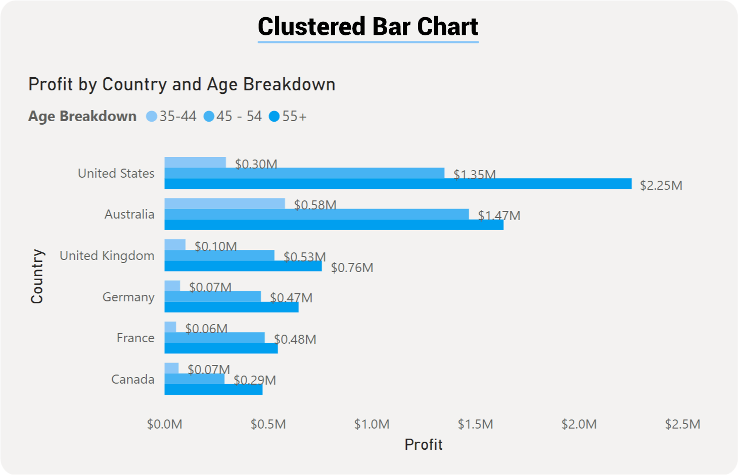
Power BI Clustered Column Chart
Bar and column graphs compere values in a single category. For example, you can compare the number of products sold by each salesperson.
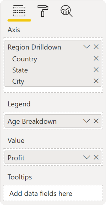
Both the Bar and Column charts are very similar in setup and how they visual data. The only difference here will be the orientation: the Bar chart uses rectangular bars horizontally where the length of the bar is proportional to the data, while the Column chart displays the bars vertically, but both are used to compare two or more values. Both of these visualizations have three different formats; Stacked, Clustered, and 100% Stacked. For our example, we will focus on the Bar chart, but users can easily switch over to the Column just with the click of a button.